


Oncology clinical trial results form the backbone of oncology medicine. How well do you understand the tables, plots, and statistics generated as a result of clinical research? During the recent ONS Congress, many presenters displayed new study data using charts with naturalistic names, such as waterfall, skyline, forest, and spider plots. Other presentations still had plenty of bar graphs, line charts, and scatter plots, but these newcomers really brought the results to life.
Oncology trial data can be overwhelming, but it is also exciting and relevant to understanding why treatment drugs and regimens may change over time. By no means am I a statistician; in fact, I am writing this blog series to help me hone my own knowledge and hopefully come up with a sort of cheat sheet to use in future study reviews. Each of the following plots are used to depict specific parameters used in oncology research. Which ones do you recognize?
Waterfall plot: Depicts a representation of each patient's response to a specific parameter, such as a drug. The results of tumor shrinkage are vertically stacked from left to right based on overall values (worst to best values across the study population). For example, early death, stable disease, progressive disease, partial response, and complete response can be tallied to give a cascading expression of a drug's activity. Waterfall plots are especially useful in larger trials, because each patient is represented by a vertical bar.
Skyline plot: Indicates the maturity of the data. Imagine a familiar big city skyline, it has likely changed over the past 20 years. Likewise, as data matures, the skyline plot looks different. Multiple time spans of data can be viewed in one skyline plot.
Forest plot: Displays a summary of the relative treatment effect of a drug. It is kind of like using a giant spotlight to compare different trees together in order to visualize key comparisons that were not evident when viewing each tree alone.
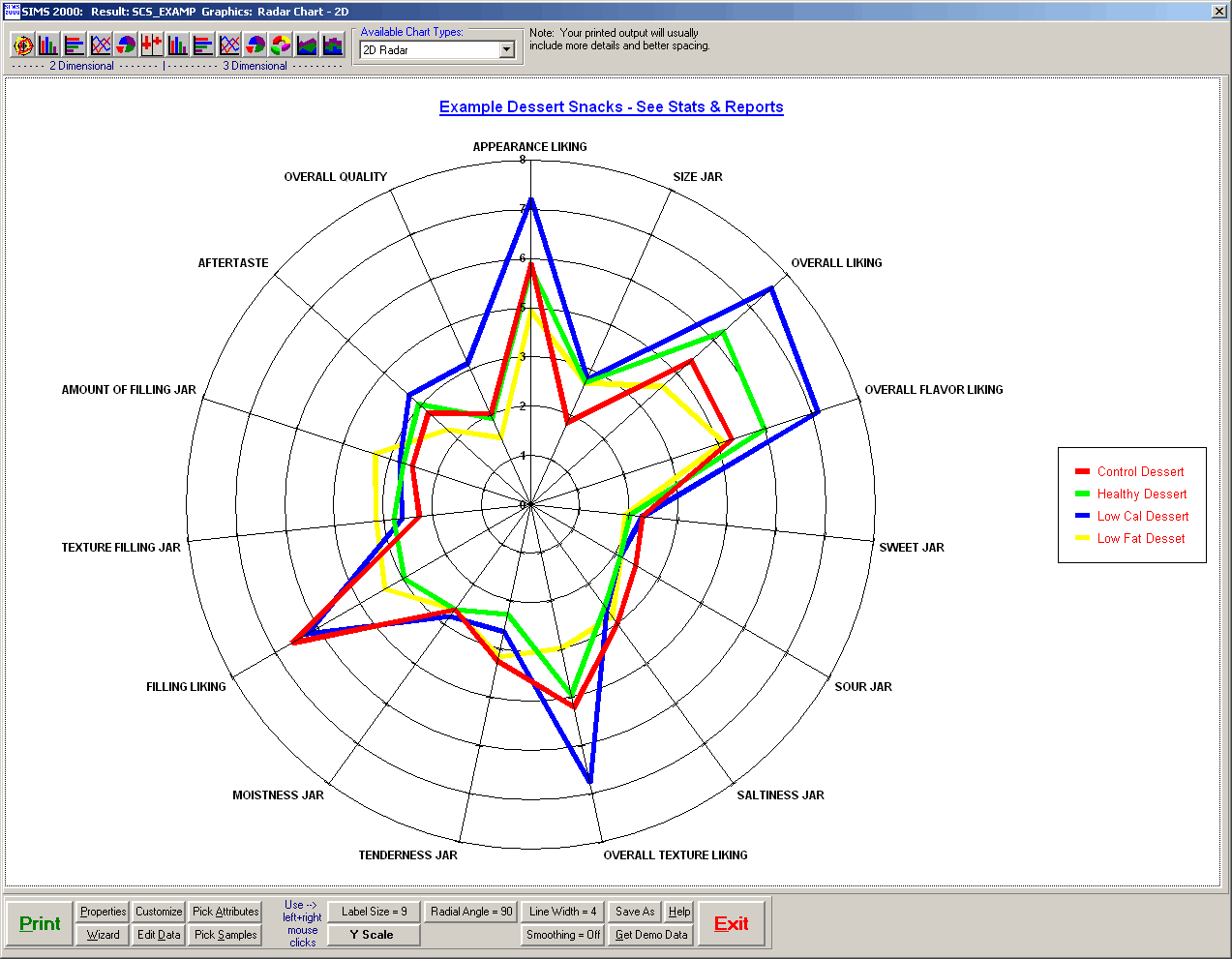
Spider plot: Represents a web-like projection of different representations of the data. Multiple variables can affect statistical results and the use of a spider plot shows the less influential variables at the center of the web and the most influential variables at the web periphery.
Next time you are reading or viewing a presentation on clinical research, keep your eyes out for these visual representations of relevant findings. Post a comment on tips you use when accessing clinical data and watch for additional blogs posts on understanding oncology clinical trials and study results.